



10 Power BI dashboard examples by industry
Use these as design inspiration — each one shows what to measure and how to lay it out for a specific audience.
1. Sales performance dashboard
A complete view of a sales team's pipeline and results. Funnel charts show how leads convert into deals, with filters for country, sales rep, and reasons for lost deals. Best paired with a report underneath for rep-level deep dives.
2. Marketing campaign dashboard
Breaks down marketing spend against outcomes — product sales, total sales, channel performance. Turns raw campaign data into clear signals about where to put the next euro. Marketing agencies building these for clients should see our marketing agency playbook.
3. Financial analysis dashboard
Tracks financial health through key ratios — Return on Equity, Current Ratio, Quick Ratio, Debt-to-Equity, EPS, and Price-to-Earnings. For regulated, client-facing finance reporting, see the financial services playbook.
4. Customer insights dashboard
Uses analytical features to surface patterns — low variance, anomalies, trends, and KPI-versus-target comparisons. Good for spotting churn signals before they become churn.
5. Supply chain dashboard
An overview page of critical logistics metrics, with deeper regional and order-level analysis a click away. A consistent colour scheme keeps a dense dashboard readable.
6. HR analytics dashboard
A summary page for headcount, terminations, and recruitment stats, giving a quick read on workforce health and hiring efficiency. More on this in the HR & recruitment playbook.
7. Product performance dashboard
Real-time KPI monitoring across charts, tables, and filters for tracking product budgets and performance, and planning allocations.
8. Operational efficiency dashboard
A live customer-support view — open cases, popular channels, and team-member performance — that keeps the team and stakeholders aligned in real time.
9. Healthcare analytics dashboard
Aggregates bed availability, equipment usage, and patient status so staff can assess situations and allocate resources fast.
10. Risk management dashboard
Monitors key risk indicators (KRIs) and consolidates data from multiple sources for a single view of operations, risk, and compliance. Relevant for cybersecurity and compliance teams.
How to create a dashboard in Power BI
Six steps from raw data to a published dashboard:
- Install and open Power BI Desktop — download it free and sign in with your Microsoft account.
- Connect to your data source — Excel, CSV, databases, or online sources via Get Data.
- Clean and prepare the data — use Power Query to fix errors, rename columns, and shape the data. (Deciding between Import and DirectQuery? See Import vs DirectQuery.)
- Create visuals in a report — add charts, tables, cards, and slicers.
- Publish to the Power BI Service — upload the report online, which unlocks dashboard creation.
- Pin visuals to a dashboard — select the key visuals and pin them to a single dashboard view.
Best practices for designing dashboards
- Know your audience. A CEO wants a one-glance overview; a CFO wants detailed financial breakdowns. Build for the person reading it.
- Less is more. Focus on the KPIs that answer the questions your users actually ask. Cut gridlines, redundant legends, and decorative clutter.
- Put the important stuff top-left. Eyes land there first.
- Stay consistent. One colour palette, uniform fonts, sensible chart choices — bar charts for comparisons, line charts for trends over time, cards for single big numbers.
- Use interactivity deliberately. Slicers, filters, and drill-throughs add power, but only where they serve the story.
- Secure the data. If different viewers should see different slices, configure Row-Level Security.
- Optimise for performance. A well-modelled star schema keeps dashboards fast; a messy model makes them crawl.
Sharing Power BI dashboards: the part most guides skip
Building a great dashboard is the easy half. The hard half is getting it in front of the people who need it — especially when those people are outside your organisation.
Inside your organisation, sharing is straightforward: publish to a workspace, share with named users on Pro licences, manage access through Microsoft Entra ID.
Outside your organisation — clients, customers, partners — it gets messy fast. Your options are guest accounts (which scale poorly), Power BI Embedded (which requires real engineering work), Publish to web (no security), or PDF exports (no interactivity). We compare all of them in the ways to share Power BI reports with external users.
There's also a licensing trap: every external viewer can mean another Pro licence, which is why teams increasingly look at Microsoft Fabric capacity to cut per-user costs.
Where DataTako fits
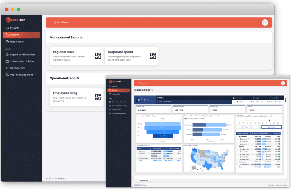
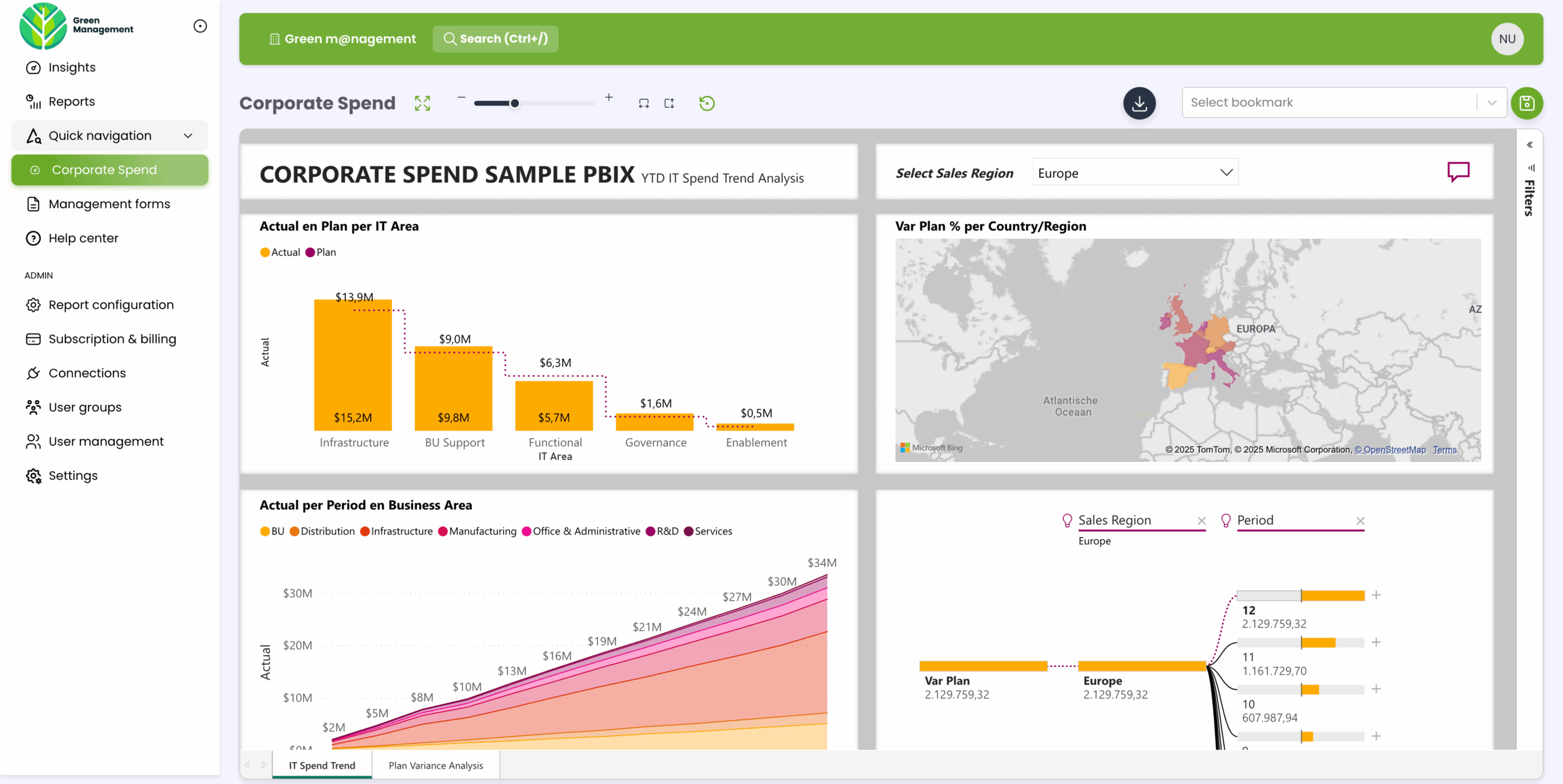
DataTako sits on top of Power BI Embedded and handles the hard half for you. You build the dashboards in Power BI as you always have; DataTako delivers them to external users in a fully branded portal — without per-viewer Pro licences.
- No extra licences for viewers — share with unlimited internal and external users.
- White-label by default — your domain, your logo, your colours, no Microsoft chrome.
- Granular access control — user-level permissions and full Row-Level Security support.
- Up and running in minutes — not the four-to-six months a custom Embedded build takes.
Teams that would have spent months building Embedded into their product are sharing branded dashboards within ten minutes of signing up. See how DataTako works or read the MeerMetData case study.
DataTako doesn't replace Power BI — your reports, models, and data stay in Microsoft's ecosystem. We're the delivery layer for external users.
Frequently asked questions
What is a Power BI dashboard? A single-page canvas that surfaces your key KPIs as live tiles pinned from one or more reports. It's built for at-a-glance monitoring rather than deep analysis.
What's the difference between a dashboard and a report? A dashboard is a single-page summary with limited interactivity; a report is a multi-page, highly interactive document for detailed exploration. Most teams use both.
Do I need a licence to create a dashboard? To create dashboards in a shared workspace you need a Pro or PPU licence. You can create them in "My Workspace" without one. Sharing through the Power BI Service requires the viewers to be licensed too — unless you use a platform like DataTako.
Can I share a Power BI dashboard with people outside my company? Not easily through the Power BI Service directly. The options are guest accounts, Power BI Embedded, Publish to web, or a platform like DataTako that handles external delivery for you. See sharing with external users.
Can I share dashboards without giving every viewer a Power BI licence? Yes — that's exactly what DataTako does, by embedding your content on a Fabric capacity so viewers don't each need a Pro licence. Try a free trial →
How do I make a dashboard load faster? Optimise the underlying model — a clean star schema, integer keys, measures instead of calculated columns, and sensible cardinality. The model, not the visuals, is usually the bottleneck.