Creating a Visual Calendar in Power BI
Creating a visual calendar in Power BI enhances data analysis by providing a clear, graphical representation of dates and events. Power BI’s robust data visualization capabilities make it an ideal tool for transforming raw data into insightful and interactive visual calendars. This guide will walk you through the process of setting up and customizing a visual calendar in Power BI, helping you to improve data interpretation and comparison across different time frames.
Benefits of a Visual Calendar in Power BI
A visual calendar in Power BI offers numerous benefits. It enhances data visualization by allowing users to see patterns and trends over time at a glance. This tool improves data interpretation, making it easier to track events, deadlines, and activities. Additionally, a visual calendar enables better comparison of data across different time frames, aiding in identifying seasonal trends and making informed decisions. Overall, it transforms complex data into an intuitive and interactive format, boosting productivity and insights.
Prerequisites
Before creating a visual calendar in Power BI, ensure you have Power BI Desktop installed. Familiarize yourself with basic Power BI functionalities and data modeling concepts. You’ll need a dataset with dates and related metrics to connect with your calendar table. Basic knowledge of using Power Query or DAX will be beneficial for creating and customizing the calendar table. These preparations will set the foundation for a smooth and efficient process in building your visual calendar.
Step-by-Step Guide to Creating a Visual Calendar
1. Setting Up the Calendar Table
- Open Power BI Desktop and go to the “Home” tab.
- Click on “Enter Data” to create a new table.
- Name the table “Calendar” and add columns for Date, Year, Month, Week Number, and Day Name using DAX formulas.
- You can find a script here.
2. Connecting the Calendar Table to Your Data
- Load your dataset into Power BI.
- Go to the “Model” view and create a relationship between the Calendar table and your dataset’s date column.
3. Designing the Visual Calendar
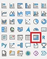
- Add a “Matrix” visual to your report canvas.
- Drag the “Day Name” field to Rows, “Week Number” to Columns, and “Date” or relevant data to Values.

4. Customization and Formatting
- Format the Matrix visual for readability by adjusting colors, fonts, and grid settings.
- Use conditional formatting to highlight specific dates or events.
5. Adding Interactivity
- Add slicers for Year and Month to enable dynamic filtering.
- Ensure the slicers interact with the calendar for enhanced user experience.
Use Cases
1. Project Management: Track project deadlines, milestones, and tasks on a visual calendar. This allows project managers to see the timeline of activities and ensure timely completion.
2. Event Planning: Organize and display events, meetings, and important dates. This helps teams stay informed about upcoming events and avoid scheduling conflicts.
3. Sales and Marketing: Analyze sales performance over time by visualizing monthly, quarterly, or yearly data. This aids in identifying trends and planning future campaigns.
4. Employee Scheduling: Manage and visualize employee work schedules, shifts, and leave days. This ensures optimal staffing and efficient workforce management.
Troubleshooting and Tips
Common Issues:
Incorrect Data Display: Ensure correct data types and relationships.
Slow Performance: Optimize by reducing the number of visuals and data points.
Tips:
Use Conditional Formatting: Highlight key dates for better visibility.
Regular Updates: Refresh data and adjust calendar settings regularly.
Test Interactivity: Ensure slicers and filters work seamlessly with the calendar.
By addressing common issues and following these tips, you can create an efficient and user-friendly visual calendar in Power BI.
Start leveraging the power of visual calendars in Power BI today to enhance your data analysis and visualization. Experiment with different formats and customizations to best suit your needs. If you ever need support, Datatako is here to help. Reach out to us for expert assistance and take your data insights to the next level.
Transform the Way You Share Power BI Reports with DataTako!
DataTako allows you to configure a fully whitelabel reporting portal in a matter of minutes, embed your Power BI reports, fully customize the look and feel and even use your own domain! You are able to share reports with anyone, anywhere in the world, including external users such as vendors or customers.